I wanted to share some thoughts on designing with a less than suitable photo.
One of the ways to get the best results, I have found, is to use the photo as a guide.
First of all, note to readers:
I'm a dedicated beadtool user. I have the other programs and have tried working with them, but Beadtool was intuitive and did what I wanted, quickly. I know I sound like I'm trying to sell it - but really I just got so frustrated working with the others, I got to a point where I didn't even try anymore. I just quit! That's pretty bad. Then I discovered Beadtool, and my muse went nuts.
But back to the subject at hand!
Often, when I try to convert a picture into a pattern, it will just look like freckled mush no matter what I do it. I will qualify this by saying I try to keep all of the patterns within certain limitations. I don't like using too many colours, or making the patterns too big, because I know realistically most folks really won't end up using it, if I do.
Here's a sample of basic freckled mush that I got from the colouring page below.
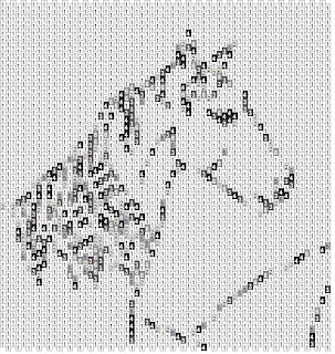
The solution that works best, when all you get is freckled mush, is often to go ahead and open the picture in the bead program.
Decide what size pattern you want and set up the empty bead grid. (I like to try starting off with something in the 3 1/2 inch range with an even number of rows.) Drag the empty grid over the picture.
Use your cursor to grab the picture and expand it until it fits (or shrink it).
Here's where the fun starts. In a picture that has several colours, or shades in it, look for the darkest color in the picture. (I like to sort of squint at it or take my glasses off.) Usually, it will be greyish black, brownish black, or blueish black. Choose the color from your pallette you think will best match, and start to trace over the darkest areas of the image. Think of a coloring book, where you have to sort of squint for the lines.
For the sample I have used an actual coloring book image to really simplify things, and picked my own colours. The key is to learn to look at images as blocks of colour, rather than as an image as a whole.
From here on out, you will be filling more blocks of colour, one at a time. I find that if I alternate between darkest and lightest, I can work my way in to the middle colours.
This may not sound very clear, until you actually open the program up and just start playing. Here's what I got first go round, when I decided to colour in the picture myself, rather than using the assimilate.
It still has one bead space that needs to be filled in - that's the number one thing you have to watch for with this technique - making sure you don't miss filling in any beads. I usually save the pattern as an image and print it out when I am doing a final proof.

I think one of the best ways to get an understanding for this technique is to start with a piece of clip art that is flat blocks of colour, or one of the free colouring pages you can find for kids on the net. (some of the colouring pages are too neat for the kids - I keep them for myself, and use them for embroidery patterns!)
The coloring page below is from http://www.coloring-page.com/page/horse-04.html
the picture is by Nicole Florian.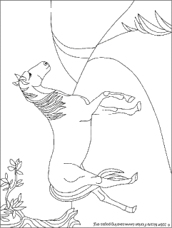 I used this as a sample of what you can find online and what you can do with it.
Please remember: Ms. Frizzle always says, "Get messy and make mistakes!!" and I agree 100% !
I used this as a sample of what you can find online and what you can do with it.
Please remember: Ms. Frizzle always says, "Get messy and make mistakes!!" and I agree 100% !


2 comments:
I love BeadTool, too; for the most, it's just so amazingly intuitive. (I just wish I could draw thread paths with it). Thanks for this wonderful guide; I've never even though about using coloring book pages before!
I have started making my patterns this way. Sometimes I get lucky and beadtool will make me a wonderful picture that I go in and adjust. But, I find I am making my own pictures a lot now that I learned how to do it.
Post a Comment