For those who have just purchased a pattern design program, or who have had theirs for a while and feel a bit stuck in a rut design-wise, there is a lot to be learned from experimentation.
One of the things that helps you understand how colors work in a pattern is to see just how far you can limit the number of colours and still get a pattern that is graphically pleasing or recognizable.
I know most people will not consider taking a photo and then trying to create a pattern with only two colors. (Clip art, maybe, but most won't try it with a multi-coloured photo) Try picking a photo with lots of colours, one of two of the colours predominating or brighter than the rest.
Then use the pattern maker with the palette limited to just two colours. Move the photo just a little and try again - did the program pick the same two colours? Can you tell what you are looking at? Interestingly enough - most of the time, the program will give a different set of colours even if you move the photo only a small fraction of an inch. Just as interesting - most of the time you will get a pretty good image of the photo subject. For example here is a pattern that was based on a section of photo with only two colours. I touched it up a small amount, but only enough to make out the main image, then stopped.
Then for instructional purposes (And admittedly frank curiosity) I left the photo and grid exactly as they were but set the pattern maker for three colours. What would the difference be? Interestingly enough, I had to do a bit more color clean up, but a very usuable image.

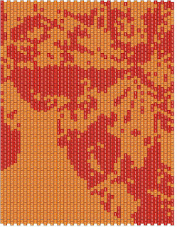
Here is the four colour:

Having done the three colour bit I then proceeded to do 4 colours, six colours and (because my patience is only but so good) 16 colours. Each time I had to progressively do a bit more colour clean up, but I feel that all five versions have merits on their own that would recommend them for a pattern. The image here is the six colour .

It also gave me a much better understanding of how the program "chooses" colors when left with a full palette to choose from with a limit on how many choices. The original pic was of four butterflies - predominantly orange, red, and yellow. The back ground was a blue-grey colour found on house siding everywhere (It was house siding, so no surprises there.) And last is the sixteen colour version.

What I found interesting was the amount of green that kept popping up, even though at even more than a cursory glance, no green was to be seen by the human eye. Never-the-less, the computer eye obviously saw green in what we would interpret as black or dark brown.
Clearly each of the versions would need more clean up to be usuable, but leaving them in a partial state like this, hopefully will give a good idea of how the different choices you make on colours will affect what you get.
I hope this will encourage you to experiment. I have used this same technique to get a basic outline and then paint in the colours I wanted. I will have another article with samples to show what you can do from this point.


No comments:
Post a Comment