Showing posts with label tips. Show all posts

5.30.2010

Doodle design

One of the things I have been doing to get out of a creative rut is doodling.  At night I spend 15 or 20 minutes with pen and paper before setting in for the night and it has helped revive my creativity.  

In part, doodling take the pressure of performance away.  It's okay to accept imperfection.    After all, you're just doodling.

I had also started to disconnect from the tangible aspects of art.  I work mostly in digital mediums to the point where I had forgotten the joy of putting pen to paper.

One of the best things to help stir up creativity is to let go and experiment.  To try things that aren't your style.  To try your style in new ways and mediums. 

For anyone who is interested in doodling as an art form, there are some great web sites and blogs.  There is even a kit you can buy from Zentangle, with all of the supplies and how to's.  For me, doodling was a flash back to middle school and filling in the time (as well as the page) while teachers droned on and on. 

4.20.2010

quilted inchie pendant

Here is the finished piece on my computer desk, being admired by a small desk gnome my youngest daughter made for me. The pendant is 1 1/16 inches x 1 3/8 inches. The fabric square (minus embroidery stitches) is one square inch.

Recently I discovered A.T.C.'s, and along the way came across a reference to "inchies," on the blog "Small World of Inchies and Twinchies." This is a fun blog with open challenges on a regular basis. I had to learn more, and came across an article about art quilt inchies.

Art and quilting and inchies? All at once? I had to try it! And it is fun!

front view, close up

This piece came together so quickly and was spontaneous every step of the way. And colour! I got to work with some of my favorite colours.

Back view, close up

I started with a one inch square piece of fabric for the top and for the bottom, as well as a piece of batting, some scraps of fabric, thread, and a glue stick.

The wire frame was a piece I had made ages ago, then decided it didn't work for what I had in mind. I had set it aside on my work table where it had languished. Suddenly, I knew the frame was the perfect thing for my first inchie. I added the embroidery at the bottom in yellow to give the piece a better fit, and button holed the piece to the wire.

I dug through my stash and came up with this nice coppery chain and a clasp to finish the piece up.

I hope others give this a try.

Just an aside - a great reference for getting started in A.T.C.'s is "Art in your Pocket"

4.14.2008

Tweaking photos for use with a pattern maker

I felt that after my last entry it would be good to look at some of the different things you can do with a basic photo, with designing a bead pattern in mind. The original pic was taken and sent to me by Jean R.

Here I took the basic pic and cleaned up the background with a couple of solid colours. I chose colours that would not be too close to the colour of the fur. It's good to keep in mind the back ground can be changed pretty easiliy, so it's not as important to have just the right colour, as it is to make sure it doesn't interfer with the main image.

I also sharpened the contrast a bit more --Again we're making changes that help with pattern designing -- the pic might not even look all that great, as is -- but it will make a better pattern.

The last change was to clean up around and fix the colour of the eyes. When doing a picture of a pet, it is very important to get the eyes to come out well on the pattern. Often the eyes are what sets the expression and mood of the image. Here I hand coloured, using photoshop.

When making my first pattern I set the level at 16 colours. Then I erased the eye, and redid them with the setting on 3 colours, and not to replace already beaded areas. This prevents the eye from being a grey colour that blends too well with the fur, instead of the nice green. It also gives you a bit more control of what colors go where, without having to edit out thirt or forty extra colours. I then hand coloured parts of the pattern around the eyes - again to give a bit more expression and to delineate the eye area.

Just for comparision - here is the pattern results one would get from the unedited photo, as well as an unedited pattern. The key things to note are the fuzziness of what detail there is, and the busy background. The image of the cat gets lost.

I think it's a good example of why you can't just rely on the camera and pattern maker software to do everything for you.

Just for fun, I tried the pattern maker set on just two colours to see what I would get -- it was pretty cool. I only touched it up with a couple of strokes around the eye area. This is a great example of why it is good to play and have fun!

Bright petals bracelet cont...

Here is the original pic.
I didn't even rotate the pic for the pattern - I just left it on it's side, and went from there. I didn't save the modified version - I think I had a brain shut down when I was working on this one. But I think it is helpful to see what you can do with a pretty blase pic, if you're willing to experiment and have fun.

3.01.2008

Of pets and people, part 1

It seems like everyone who first gets a bead pattern program will take a picture of a fav person and try to turn it into a bead pattern (I sure did!) And more often than not it either looks like an abstract mess, or it ends up being a huge tapestry with 200 colours!

Working with pictures of pets and people can be some of the toughest, but most rewarding results when designing patterns.

I want to share some of the things I have learned, that help get better results.

I have found that the largest I should get is 4 to 5 inches. This keeps the diminsions realistic (I know I'm less likely to finish that huge tapestry I started as my first project EVER, than I will the 3 inch amulet bag. )

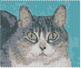
The design above is a good example of this principle. It's finished diminsions are just a hair over 3x4 inches.

I did go a bit over on my number of colours rule - this one ran about 22. but several of those colours were in small sections for the nose and eyes - places where a small amount gives a lot of impact. knowing that it would take less than a gram for several of the colours makes it a less expensive project in the long run. It's a delicate balance between getting enough detail and having something become too speckley

I have found that after the numbers get over 16 to twenty colours the difference starts to get less noticeable on the detail. In fact sometimes the detail can become very muddy and speckled if there are too many colours in the pallette. Notice how the background of this graph is a solid green. When the pattern first converted, there were several didfferent greens and it was just too much going on in the graph.

There are several ways to limit how many colours are used.

The most basic is to edit the photograph being used, before you ever open a bead pattern program. To edit photos, I usually use adobe photoshop, but there are many different ones out there including the basic paint program that comes with microsoft.

One of the key things about a photo is to look at what you want to stand out when you convert it into a pattern. Everything else non-essential should be removed or turned a solid colour. Other wise, it will use up a lot of your pallette to creating a background for your image. If there is too much going on in the background, it becomes a very busy pattern.

Of course, there are always going to be exceptions to the rule, but the best results usually come from keeping the image simple.

Another basic way to limit your pallette is to tell the program to use a limited number of colours from the begining. -The draw back is that sometime you will end up the computer substituting colours that aren't accurate. A perfect example of this is a parrot picture I worked with recently.

The pattern was important - it was of a pet who had been in the family for over thirty years and recently passed away. The person I was designing for would have probably been upset, if her pattern had come back looking like someone elses bird, due to colour substitutions.

The first graph has a couple of things about it -- The most prominent is the cheek of the parrot is green. The original picture I was using, however, shows the bird with an orange cheek. I had to get the cheek to show the proper colour without adding too many colours to the final picture.

The first graph also shows a corona around the bird. Flash pictures will often translate this way in bead patterns, and while it can be an interesting design element, for simplicity I felt here it need to be erased. I used the fill function to make it the same as the rest of the background.

By using the eraser funtion (I use Beadtool 2) I cleared out only the area of the cheek, which was mis-coloured. Then I had the program recolour it using only four colours and to not colour any area that was already filled. This allowed me to control the total to only 20 colours.

Because this is a special display piece, I did make it a bit larger - it is 4 x 6.5. However, because I felt she might also wish to have a piece to wear as well, I also did a smaller version which uses only a portion of the image.

Related Posts with Thumbnails